


Interface, a global leader in commercial flooring and sustainability-focused interior solutions, has announced the expansion of its Open Air™ Neutrals carpet tile collection with the introduction of eight new warm colorways. The latest additions are part of the company’s newly introduced design initiative known as “The Warm Edit,” a curated approach that highlights the growing demand for warmer, more inviting tones in modern commercial interiors.
The expansion reflects broader shifts in workplace, healthcare, education, and hospitality design, where architects and interior designers are increasingly selecting colors and materials that promote comfort, emotional connection, and well-being. Industry trends have steadily moved away from colder, highly industrial aesthetics toward softer, more human-centered environments that encourage collaboration, relaxation, and productivity. Interface says the new collection enhancements are designed specifically to support these evolving design priorities.
According to the company, The Warm Edit serves as a simplified specification tool that helps designers navigate a wide selection of warm neutrals already available throughout the Interface portfolio. By organizing complementary tones into a cohesive design framework, the initiative is intended to streamline the material selection process while supporting contemporary commercial interior trends.
The newly added warm colorways expand the Open Air™ Neutrals collection with tones that offer increased depth, subtle richness, and greater visual warmth. These additions are designed to work seamlessly alongside existing flooring products across the Interface portfolio, including carpet tile, luxury vinyl tile (LVT), and nora rubber flooring products. The company believes the expanded palette will allow designers to create more cohesive and layered interior spaces across a variety of commercial applications.
Kelly Simcox, Head of Global Design at Interface, explained that warmer palettes are becoming increasingly important in commercial design as organizations seek to create environments that feel more welcoming and emotionally engaging. She noted that designers are using warm neutrals to introduce softness, texture, and visual comfort into spaces that traditionally relied on cooler and more minimal color schemes.
Simcox stated that Interface developed The Warm Edit and the Open Air expansion to make it easier for customers to identify trend-forward neutral color options without sacrificing the durability and performance standards required in commercial environments. According to the company, the goal is to combine strong aesthetic appeal with practical functionality, enabling designers to create interiors that are visually inviting while still meeting the operational demands of high-traffic spaces.
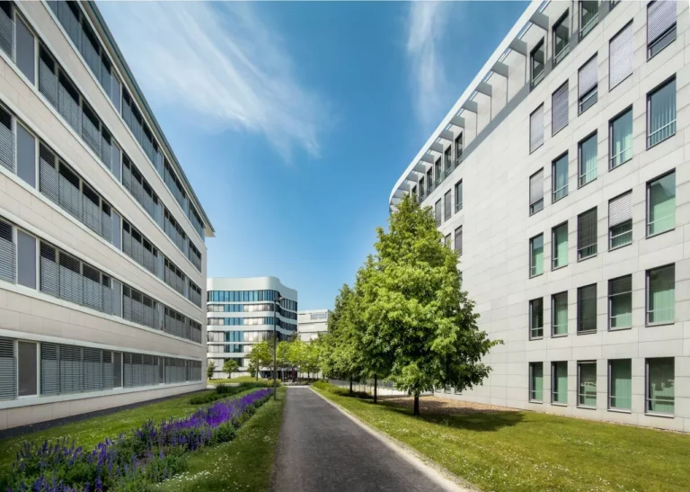
Open Air™ has become one of Interface’s key flooring platforms because of its versatility and affordability for large-scale commercial projects. The carpet tile system was developed specifically for expansive floorplates and open-plan environments, where consistent patterning and coordinated aesthetics are essential. The collection’s adaptable design allows it to integrate effectively across multiple space types and building sectors.
The addition of the eight new warm tones builds upon the collection’s existing neutral palette, which already includes a combination of classic cool shades and subtle warmer hues. Interface says the expanded range introduces greater dimension and visual clarity while maintaining the clean patterning and understated design language that has made Open Air popular among designers and specifiers.
The refreshed collection is intended for use across a broad range of commercial environments. In workplace settings, the new warm neutrals can help create more comfortable and collaborative office interiors that support employee well-being and productivity. In healthcare environments, softer and warmer flooring palettes may contribute to calmer, less institutional atmospheres for patients and staff. Educational facilities can also benefit from the warmer tones by creating more welcoming and engaging learning environments.
Interface highlighted several key advantages associated with the expanded Open Air™ Neutrals collection. One of the primary benefits is its ability to support cohesive flooring installations across large open spaces. The consistent patterning and carefully coordinated colorways allow designers to maintain visual continuity throughout expansive commercial interiors while still incorporating subtle tonal variation.
The collection is also engineered to meet the durability requirements of demanding commercial applications. Interface emphasized that the carpet tiles are designed for high-performance use in environments with significant daily foot traffic, making them suitable for offices, healthcare facilities, schools, and public buildings.
Another feature of the Open Air platform is its simplified pricing structure. The collection is offered at a single accessible price point, allowing designers and project teams to select from a wide variety of styles and colors without navigating multiple pricing tiers. Interface believes this approach helps simplify budgeting and specification decisions during project planning.
In addition, the products are included within the company’s QuickShip program, enabling delivery within approximately three weeks. Fast lead times have become increasingly important in the commercial interiors market as construction schedules tighten and project delivery expectations accelerate. Interface says the availability of quick-turnaround flooring solutions can help designers and contractors maintain project timelines without compromising on product selection.
The broader Warm Edit initiative organizes Interface’s warm-neutral offerings into four curated design palettes, each developed to support different aesthetic approaches within commercial interiors.
The first palette, called “Soft Landing,” focuses on subtle neutrals with cooler undertones balanced by understated warmth. This palette is intended to create calm, refined environments with a gentle and sophisticated atmosphere.
The second palette, “Quiet Contrast,” introduces soft olive accents and contrasting tones designed to add visual depth while preserving brightness and openness within a space. Interface says this palette allows designers to introduce subtle character without overwhelming an interior.
“Dual Aspect,” the third palette, combines warm and cool tones to create balanced contrast and visual movement. This approach offers greater flexibility for designers looking to blend contemporary and traditional design influences within the same environment.
The final palette, “Rich Warmth,” emphasizes deeper and more saturated hues inspired by natural materials such as clay, terracotta, wood, and earth tones. These colors are intended to create grounded and inviting interiors with a strong sense of warmth and texture.
Together, the four palettes are designed to provide designers with a cohesive framework for incorporating warm neutrals into commercial projects across multiple sectors. Interface believes this structured approach simplifies decision-making while giving designers the flexibility to create customized environments that align with current interior design trends.
The launch of The Warm Edit and the expansion of Open Air™ Neutrals further reinforce Interface’s ongoing strategy of combining design innovation, sustainability, and high-performance flooring solutions. As commercial interiors continue evolving toward more people-focused and experience-driven environments, the company aims to provide products that balance aesthetics, durability, and operational efficiency.
By expanding its warm-neutral offerings and simplifying the specification process, Interface hopes to support architects and designers in creating spaces that are not only functional but also emotionally engaging and visually comfortable for the people who use them every day.
Source Link:https://www.businesswire.com/